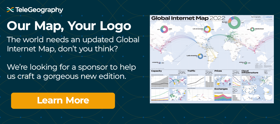
You might not be surprised to learn that we have a lot of maps here at TeleGeography.
They're on our walls. They're folded in our desk drawers. They're sitting in boxes that crawl up the wall. We even have a table in the middle of the office known as the "map table." It's covered in maps hot off the press, proofs of upcoming designs, and inspiration for future endeavors.
For weeks now, it wasn't uncommon to come into the office and see a small group of people around the map table, poring over ideas for our next submarine cable map, one of the most popular maps in TeleGeography's portfolio.
Vice President of Systems and Design Markus Krisetya was always among the huddle—often flanked by Lead Cartographer Larry Lairson and Vice President of Research Tim Stronge—with a magnifying glass in hand, double checking that submarine cables were labeled, features were legible, and every little detail was just right.
As we release our 2017 map, Markus was kind enough to sit down with me and talk about the map's history and the process of taking submarine cables and turning them into art. Read the full interview below or listen here.
Jayne Miller: Thanks for taking the time to talk about the map, which came out this week. It's always a very exciting time here at TeleGeography. I'm sure you're glad to see the boxes roll in.
Markus Krisetya: Yes. We are very pleased. It's probably one of everyone's favorite maps at this point.
JM: How long have we been printing this map? What's some of the history?
MK: TeleGeography's first telecommunication map was published in 1996. So it was a long time ago. It was produced with the help of a sponsor and we included quite a bit of information on that map.
It also happened to be the map that I discovered as a graduate student studying international relations, and I was fascinated with this map from the first time I saw it. And this was a map that, at that time, included only a handful of submarine cables that were active. And if I'm not mistaken it was 25 cables; and our current map has 293!
So there's a long history of what this map has documented over the course of time in terms of submarine cable deployment.
JM: So seeing this map grow and change over time, I wonder if you have any highlights from the evolution of this product. Perhaps different features that have been added to it, taken away, changed over the years—maybe even themes you've embarked on.
MK: Definitely. So, when we first started tracking submarine cables, [there were] obvious small themes that we have continued carrying throughout our maps, which are data about submarine cable bandwidth growth, different prices that are available on submarine cables, as well as the cost itself to build these cables.
But as we continued to track this information, we recognized that other themes began to develop that were important for us to add. This included, for instance, very detailed submarine cable landing point maps, because we realized as more cables were being built, the endpoints of where the cables head are just as important as the cables themselves.
We realized as more cables were being built, the endpoints of where the cables head are just as important as the cables themselves.
Then over time we began to develop other bigger themes that were important for our readers. And our chief analyst Alan Mauldin came up with a concept called resiliency, which measures how many international submarine cables are connected to a particular country. The United Kingdom [and] the U.S. are obvious leaders in this space. They were among the first few countries to be connected by submarine cables. Obviously, resiliency is a critical factor, especially in countries where there is only one or two submarine cables connected. Where a breakage in one of these cables that connect these countries would result in an internet outage that cannot be resolved by moving traffic onto other submarine cables.
JM: Have you ever added anything to the map based on trends or key conversations happening in the cable community?
MK: A big topic today—because now there's so many submarine cables online—how quickly data can travel across a submarine cable has become really important. And that is measured in a data point called latency. So we started including latency data in our 2012 map and it's been one of the recurring themes on our submarine cables.
JM: So this map has come a long way, it seems.
MK: Definitely. [The] submarine cable map became a standalone map in 2000. That's when there was an editorial decision made to separate some of the other big stories about telecoms and focus exclusively on submarine cables.
So, in that year, the first official submarine cable infrastructure map was produced. And it focused primarily on submarine cables and, at that time, there was a little bit of satellite data because satellites still played a prominent role in some parts of the world. So that was where that first map started. But what the main goal of the map was, was to show what is the backbone of modern telecommunications. And that is submarine cables, as it continues to be today.
So that was where that first map started. But what the main goal of the map was, was to show what is the backbone of modern telecommunications. And that is submarine cables, as it continues to be today.
So what you can find on the submarine cable map—there will be information on capacity growth, there'll be information about how much it costs to deploy some of these submarine cables. There's some information about pricing in terms of bandwidth that's available on these cables.
And this main narrative continues over time. But as we continued working on this map for as long as we had, we made a decided shift to focus [each map] even more exclusively on a specific theme—back in 2013. So after focusing the map on all these different elements and continuing a repetition of this, there's certain themes that began to develop that we decided would be the focus each map starting in 2013.
So, in that year, in addition to the basic information that we presented in previous maps, we decided to create, I guess maps as art.
So we focused the map on "what kind of design could we include in the year's submarine cable map that would be different than in previous years?" And that tradition has continued to the most current map that we have.
So we focused the map on "what kind of design could we include in the year's submarine cable map that would be different than in previous years?" And that tradition has continued to the most current map that we have.
JM: And this year, if I'm not mistaken, we're really borrowing something from our favorite fictional archaeologist Indiana Jones. You know, with field notes and a journal—it looks like it's actually a pretty fun process to brainstorm all of these different artistic and creative themes.
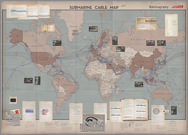
The 2017 map is modeled after an adventurer's notebook.
MK: Yeah, it's become a very...much more involved project. I guess you could describe it that way. Since we started creating thematic maps we had to spend a great deal more time researching the information behind the theme we're trying to develop. And in this case, we had to do our research in terms of trying to find artifacts and design ideas that we could borrow from the Indiana Jones adventures and try to figure out how to incorporate those elements into what became our most current map.
JM: I know it's so much work to put each one of these together, so not to put you on the spot, but do you have a favorite map theme you've worked on so far that you just love the aesthetics—or maybe the research that went into designing something around sea monsters or, again, Indiana Jones or something like that?
MK: Well, the sea monster map was definitely one of my favorite maps. It was a map I had envisioned when I started becoming the creative director, so to speak, for the submarine cable maps. I knew this was a map that would have some broader resonance across an audience, but I just didn't have the time or the skills to produce this map. And once we hired Larry [Lairson], who is now our chief cartographer, I realized he had a combination of both the aesthetics as well as the programming background that could make a map like this a reality.
I think it was after—this was 2015—so once we committed to this project and this theme, I think this was the longest amount of development time that we spent on any of our maps. So it was over six months long. Both from the idea to the research and then the creation of the artwork itself.

The 2015 Submarine Cable Map, depicting real (anchorage and fishing activity) and imagined dangers in the ocean (sea monsters).
JM: I think it's one of my favorites, too. And a fun fact for our blog readers and listeners is that that map is actually on one of our walls in the TeleGeography office. So, the sea monster map gets a lot of play.
Since we're talking about the process and how these things come together, what is something that might be surprising to the people who buy our maps every year about how we actually take the globe and undersea cables and bring it all together?
MK: I think one thing that would surprise a lot of people is that we actually have to go to an actual printer in Milwaukee to actually print this map. I think there are a lot of assumptions about digital printing that people are very familiar with because it's consumer-end technology that a lot of people have access to.
But to print our maps, we have to print it on what's called an off-set printer. And there are only a very few places in the United States where there are printers that are large enough that can print the map we have designed. And just through kind of an accident of working with different people, we've ended up with a group of printers clustered around the greater Milwaukee area. So there are paper manufacturers, there are paper folding companies, there are silkscreen companies that are all focused around Milwaukee, so that's been our homebase where one of us in this office has to go there to do what's called a press check and review the output of the printer as it rolls out off the press, so to speak.
JM: That's interesting—so just like the map illustrates that the world of communications is far more physical than we ever give it credit for, the process of printing our map might be far more physical than we give it credit for with the actual printing process.
MK: Yeah. There's actually a place where this all happens. It's not ephemeral. And so the physicality of the map also kind of explains a little bit about our map's style, in a way, because we could very easily draw the submarine cable map as a schematic that's much more abstract, that just shows different lines and how they connect to different dots. But if you look at all of our maps, there is the element of geography behind it. And I think that is something that's very core to our map design. It's that people can understand physical geography, and that is a reference point that I think is important.
But if you look at all of our maps, there is the element of geography behind it. And I think that is something that's very core to our map design. It's that people can understand physical geography, and that is a reference point that I think is important.
That makes our maps a little bit more accessible to people because it does refer to place. It does refer to connections between point A and point B where they understand. Whereas, other maps might be a little more conceptual. It's pretty, but people don't relate to it in the same way that they relate to our maps because there is the element of geography behind it.
JM: There's a landing station here and a landing station here and I can wrap my brain around it, and between those two points is a cable in which information travels. And we can see that and sort of, again, just grasp how that might work on the scale of the globe.
Turning back to this year's map, which again we're very excited to release this week, and our fantastic adventurer theme—I did notice that with these journal entries and handwritten notes that we found around the outside of the map, there seem to be a few clues. Is it safe to assume that, you know, like any of Indiana Jones' artifacts that this one might lead to buried treasure?
MK: Yes this is one Easter egg that we planted in this year's map. So not only did we borrow the idea of Indiana Jones and his adventures and the graphic style from that era, we realized it could be fun to include a different type of adventure on our map. A kind of treasure map that's hidden inside our map itself, the same way Indiana Jones uses his journals to find the lost ark or the holy grail, we also have hidden, in our map, clues that will lead to a trove of treasures, let's just say.
JM: I guess we'll leave it at that. And we hope that some of our listeners who pick this map up or maybe get their hands on one at ITW, which is coming up in a few weeks, have the chance to go on their own adventure.
Alright, so thanks for telling us about this year's design and how it all comes together.
MK: You're very welcome.