While our interactive submarine cable map is updated on a rolling basis, printed editions are unveiled annually. Each edition has a different theme, and our team always tries to out-do last year’s release.
Can you guess what inspired our latest design?
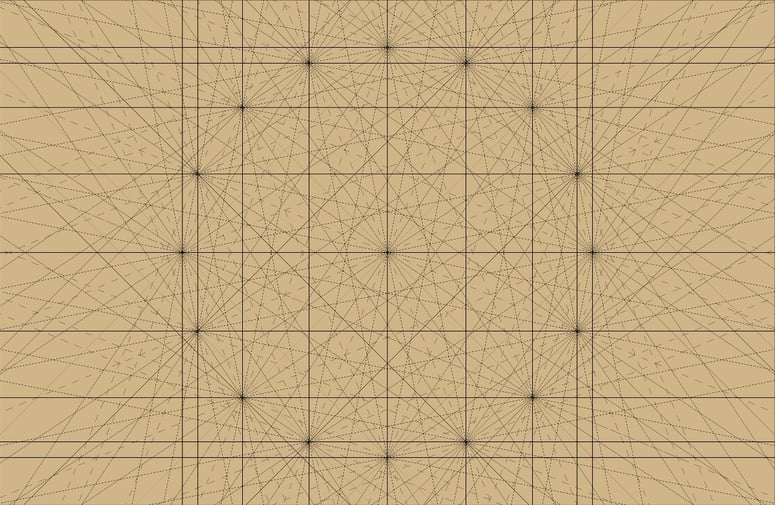
What are windrose networks?
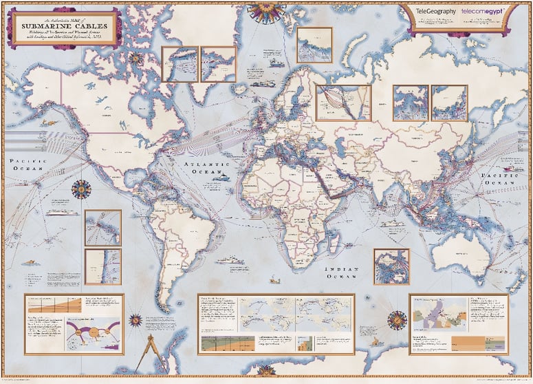
If you look closely, you'll find sea monsters, ornate compass roses, and windrose networks woven in.
Historically, a windrose network was a crucial navigational aid found on portolan charts and other early nautical charts used during the medieval age and the Age of Exploration.
Navigators used these windrose networks before accurate surveys and map projections were available. Navigators could use these sailing paths to chart a path from point A to point B.
These schematics were ultimately a directional matrix of sailing winds—a navigational aid created by overlapping a series of compass roses. The resulting design allowed navigators to generate a “line of course," a path to a destination.
The lines actually represented constant magnetic bearings or compass directions. Navigators would use these to plot courses between ports by drawing a line between their origin and destination and then using a parallel rule to transfer this "line of course" to the nearest compass rose to determine the required compass bearing.
The design of these 16th-century nautical charts (also known as portolan charts) inspired the look of our 2023 Submarine Cable Map.
To learn more about how the 2023 map was designed and produced, we recommend Episode 418 of TeleGeography Explains the Internet.
We interviewed two of the masterminds behind TeleGeography's Submarine Cable Map—research Senior Analyst Lane Burdette and Designer/Cartographer Larry Lairson—to learn about the data and design of our latest map.
We first talk to Lane about what data goes into our submarine cable maps, how we collect that information, what's new in this year's edition, and more. Then we pass the mic to Larry to discuss his design process. How does he translate the data into beautiful visuals like this windrose concept? How geographically accurate is the info on our maps? How are the design themes chosen for printed maps?