


At TeleGeography, we’ve been working on a project called the Interconnection Index. This tool is designed to answer some questions that we’ve found very difficult to answer and quantify in the past.
What is the next emerging hub in a specific region? How do various hubs compare to each other? Where should I expand in a certain country besides the largest city?
It would be quite challenging to create a one-size-fits-all model that can answer all of these questions appropriately. But we’re still going to try!
We’re going to address this problem with data, and—because we’re geography geeks—maps.
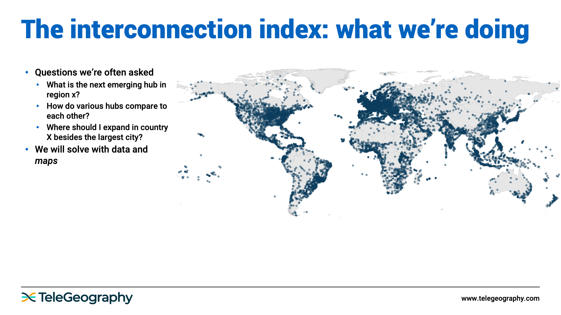
In the map above, every blue dot is a metropolitan area that TeleGeography tracks. There are about 8,200 of them that we’ve collected data on for one reason or another.
And by metro area, I mean an agglomeration of cities, so Washington DC would be one metro area—we're not counting all the individual elements of Northern Virginia, the District of Columbia, and Maryland.
Here’s the framework for how we’re going to try to address this.
So that’s a theoretical example; now let’s talk through a practical working example.
Now for the fun part: the actual model outputs.
As of now, here are the top five scoring hubs in the world:
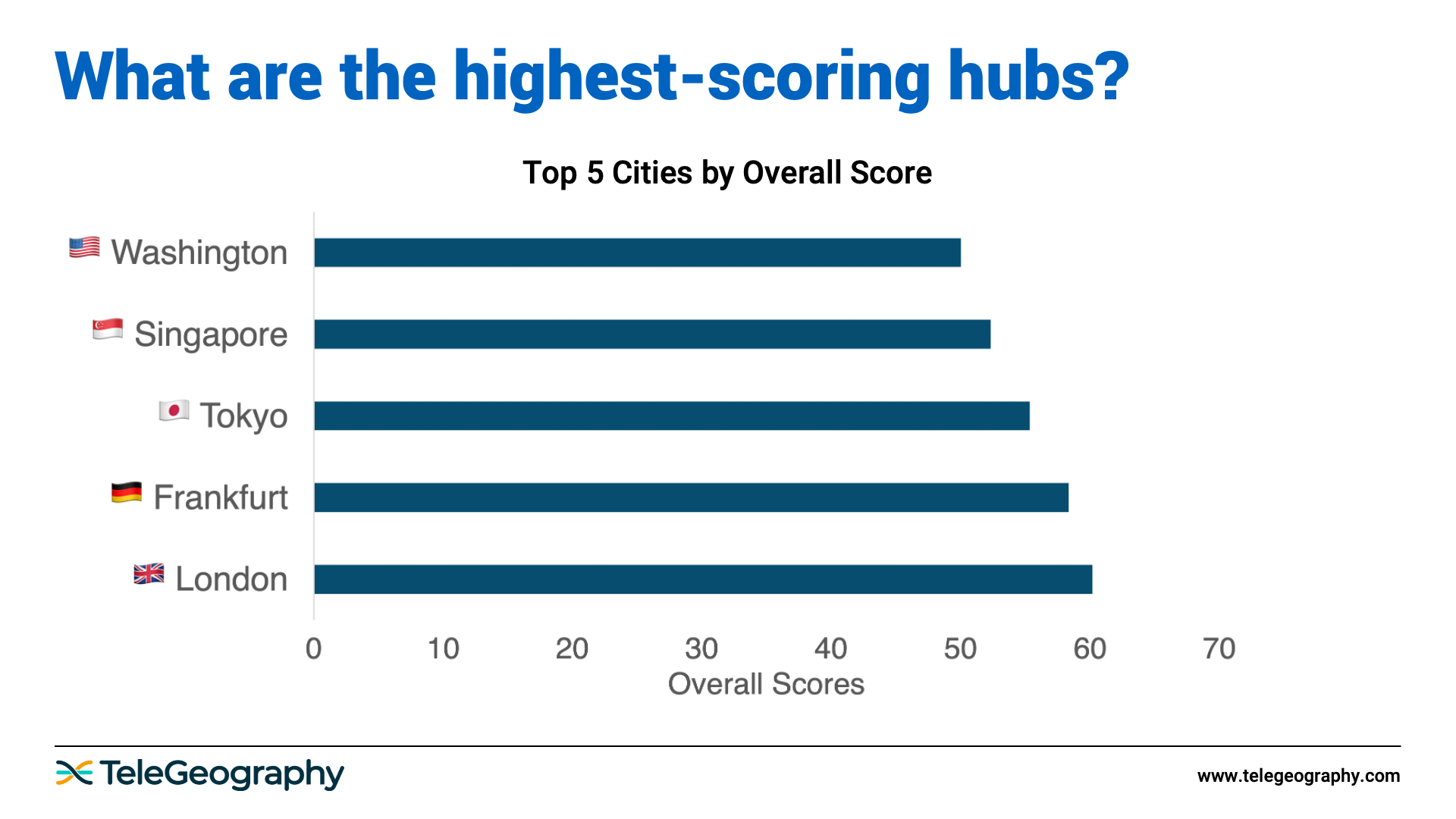
But that's just top-level ranking—the top of the pyramid.
Picking a number is not terribly meaningful. London is number one, but what does that mean? Why is it number one?
If you start breaking out why it scored so highly, this all becomes more interesting. A city might be strong in some areas but weak in others. This is particularly important because not everyone in the industry has the same needs.
A company that’s investing in AI and wants to find a place to train its models will care about lots of power, potentially renewable power. However, a CDN will want to know where the end users are.
So where does London do well?
On the east side of the chart below, you’ll see telecom infrastructure criteria. The west side more so measures market potential.
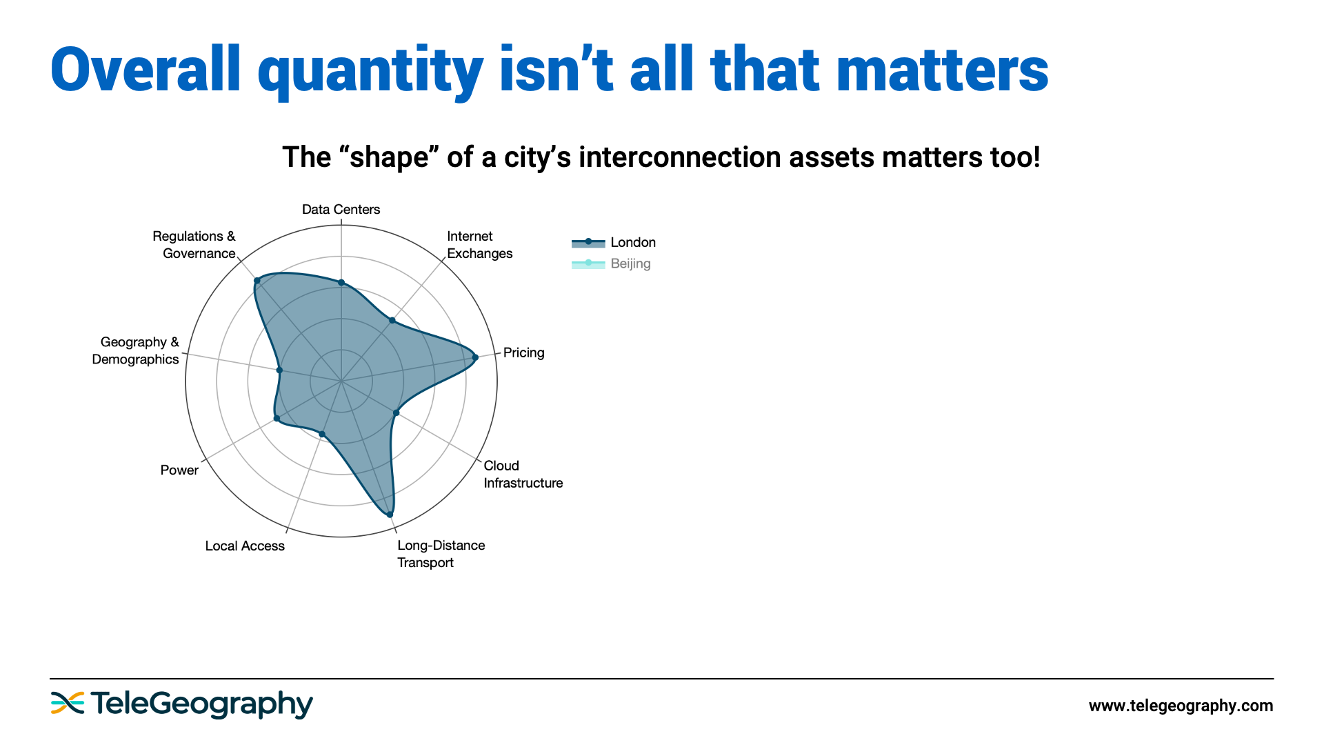
The further out a section reaches, the higher the score. As you can see, London does particularly well in pricing and long-distance transport, and it has very stable regulations compared to other places in the world.
Let’s spice things up by overlaying another metro area.
As we do this for lots of different hubs, we start seeing interesting patterns.
Below are the top three hubs—as of now, this may change—for every region.
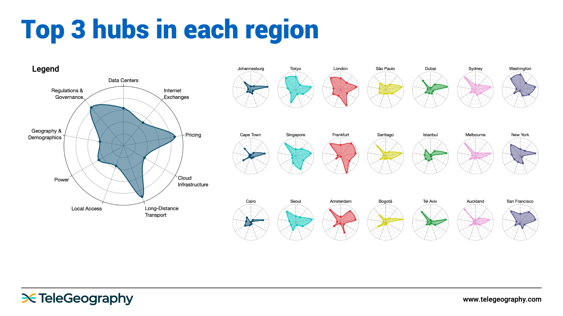
The smaller hubs tend to have spikier, starlike shapes. This is because they're very good in a few areas, but not as universally strong.
The higher scoring hubs are more well-rounded, literally; their shapes are rounded. This is because they do a lot of things well. Tokyo, Singapore, Frankfurt, London, and even São Paulo—these are areas that are compelling for investment for a lot of reasons.


Tim Stronge
Tim Stronge is Chief Research Officer at TeleGeography. His responsibilities span across many of our research practices including network infrastructure, bandwidth demand modeling, cross-border traffic flows, and telecom services pricing.